WasteDump
A business website that turns an operational service brand into a credible, well-structured online presence.
WasteDump needed a straightforward website that communicates its operational services with more structure, stronger credibility and better page discipline. Operational brands still need refined presentation, so KAPAT focused on cleaner service explanation, more disciplined layouts and consistency across pages.
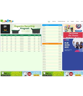
Project interface
- Client
- WasteDump
- Project Type
- Operations website
- Industry
- Operations & Sustainability
- Platform
- Responsive web
- Engagement
- Business website design and responsive front-end delivery
- Status
- Delivered
Business Context
An operational service that is judged online before it is judged on the ground.
WasteDump provides operational services in the waste and sustainability space. Customers of a service like this want to know quickly what is offered, whether the business looks established, and how to make an enquiry. A cluttered or inconsistent website undermines that judgement before any conversation starts.
The brief was a business website with a clearer explanation of services, tidier layouts and a corporate visual tone applied consistently from page to page, so that the presentation matches the seriousness of the operation behind it.
The Challenge
Turn an operational service brand into a more credible digital presentation with clearer explanation and stronger page discipline.
01
Sharper content organisation
Service copy had to be organised so that a visitor understands the offer quickly, without wading through detail.
02
Reduced clutter in service sections
The key browsing sections needed fewer competing elements and a clearer order of information.
03
Professional corporate visual tone
The visual language had to read as established and professional, consistent with a business customers can rely on.
04
Clearer enquiry-ready experience
Every service page needed an obvious route to enquiry once the visitor had understood the offer.
KAPAT Approach
How KAPAT approached the work.
01
Discover
Reviewed the operational services, the customers who buy them and where the existing presentation lost credibility.
02
Structure
Planned the service explanation structure and a consistent page pattern across the site.
03
Design
Designed a disciplined corporate visual tone with clutter removed from service sections.
04
Build
Delivered the responsive front-end with consistent content layouts from page to page.
05
Refine
Tidied brand presentation details and checked visual rhythm across the key browsing sections.
What Was Delivered
What was delivered.
01
Business website design
A corporate website design that presents the business as established and easy to deal with.
02
Service explanation structure
Service copy organised for quicker understanding, with each area explained in a consistent pattern.
03
Responsive content layout
Content layouts that keep their discipline on mobile and desktop, with clutter reduced in key sections.
04
Brand presentation clean-up
A tidier, more consistent application of the brand so that pages read as one site.
Interface
Selected interface views.
Verified screenshots only. Frames marked in preparation are replaced as screenshots are approved for publication.
Project Interface Preview
Content In Preparation
Project Interface Preview
Content In Preparation
What KAPAT Handled
KAPAT's contribution.
Outcome
The published site communicates services with more structure and a visibly stronger corporate tone, helping the business feel more established online.
Related solutions and services
Related Solutions
Work
Need a system built with this level of care?
Start with the business problem. KAPAT will define the architecture, the scope and the engineering approach with you.
A direct conversation with the engineers who would build the system — no sales layer in between.
View Services