Timer App
A utility app concept that makes everyday timing quick to set, easy to repeat and instantly understood.
Timer App is a compact mobile utility concept designed around ease of use, quick setup and interface clarity for repeat daily interaction. Simple products still need discipline, so KAPAT emphasised clarity, repeatability and a cleaner interaction model that feels intuitive without excess decoration. The work is an interface concept rather than a deployed product.

Project interface
- Project
- Timer App
- Project Type
- Utility app design
- Industry
- Productivity
- Platform
- Mobile (iOS / Android) — concept
- Engagement
- Utility-focused mobile UI and interaction design
- Status
- Design concept; not a deployed product
Business Context
A small tool used many times a day, where every extra tap is noticed.
A timer is opened for a few seconds at a time, repeatedly, throughout the day. Users do not read instructions and do not tolerate friction: the control they need must be where they expect it, and the same action must work the same way every time.
The concept treats this simplicity as a design constraint. Core controls are reduced to what setup needs, the screen hierarchy is kept flat, and repeated actions share one interaction pattern so that the app becomes habitual rather than learned.
The Challenge
Make repeated daily timing actions quick to set, easy to repeat and immediately understandable without extra learning effort.
01
Low-friction interface patterns
Setting a timer had to take the fewest possible steps, with controls that need no explanation.
02
Simple hierarchy for everyday use
Screens had to present one clear task at a time rather than a menu of options.
03
Consistency across repeated actions
Start, adjust and repeat had to behave identically wherever they appear, so the app rewards habit.
04
Reduced cognitive load in primary flows
The primary flows had to be usable with almost no attention, which meant removing rather than adding.
KAPAT Approach
How KAPAT approached the work.
01
Discover
Identified the handful of timing actions that make up almost all everyday use.
02
Structure
Simplified the task model to a flat screen hierarchy built around setup and repeat.
03
Design
Designed minimal controls and a single interaction pattern for every repeated action.
04
Build
Produced the concept screens with consistent components across the primary flows.
05
Refine
Reviewed the flows for anything that added a step or a decision and removed it.
What The Concept Covers
What the concept covers.
01
Utility-focused mobile UI
A compact interface in which the core controls are simplified for quicker setup.
02
Task simplification
The everyday timing tasks reduced to their essential steps.
03
Minimal interaction design
Repeated actions handled with one consistent interaction pattern, without decoration.
04
Cross-screen consistency
Primary screens that share layout and behaviour, designed for low-friction daily use.
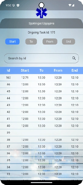
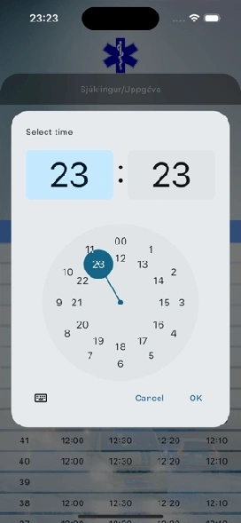
Interface
Selected interface views.
Concept screens as published in the KAPAT portfolio; not captures of a deployed product. Frames marked in preparation are replaced as images are added.
What KAPAT Handled
KAPAT's contribution.
Design concept
This is a design concept: no system was deployed, so there is no outcome to report. The screens show the interaction direction KAPAT proposed.
Related solutions and services
Related Solutions
Work
Need a system built with this level of care?
Start with the business problem. KAPAT will define the architecture, the scope and the engineering approach with you.
A direct conversation with the engineers who would build the system — no sales layer in between.
View Services