MP Health
A healthcare website that reassures visitors and puts essential information within easy reach.
MP Health needed a patient-friendly web presence built around clarity, reassurance and straightforward access to key information. Healthcare-facing interfaces need calm design and strong readability, so KAPAT emphasised accessibility thinking, a confidence-building content flow and responsive performance.
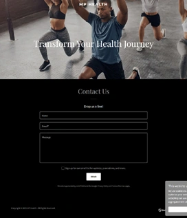
Project interface
- Client
- MP Health
- Project Type
- Healthcare website
- Industry
- Healthcare
- Platform
- Responsive web
- Engagement
- Healthcare-focused design, content hierarchy and responsive delivery
- Status
- Delivered
Business Context
A healthcare audience that arrives with a question and little patience for noise.
MP Health serves visitors who are looking for healthcare information, often at a moment when they are anxious or in a hurry. For a website in this sector the job is not to impress but to reassure: state clearly what is offered, make the essential facts easy to find, and avoid anything that gets in the way.
The brief asked for calm design and strong readability. Typography and spacing had to work on small devices for a broad audience, navigation had to stay simple, and the content hierarchy had to build confidence as the visitor moved through the site.
The Challenge
Reassure healthcare visitors, surface essential information faster and create a calmer digital experience for trust-sensitive journeys.
01
Calmer visual language
Trust-sensitive pages needed a restrained visual tone that reassures rather than distracts.
02
Faster access to essentials
Key information had to surface early in the browsing journey instead of being buried under introductory content.
03
Readable typography on small devices
Type sizes, line lengths and spacing had to remain comfortable on phones for readers of all ages.
04
Simple navigation for broad audiences
Navigation patterns had to be obvious to visitors with widely varying familiarity with the web.
KAPAT Approach
How KAPAT approached the work.
01
Discover
Reviewed the audience, the information visitors most need and the points where reassurance matters.
02
Structure
Planned a credibility-driven content hierarchy that brings essential information forward.
03
Design
Designed calmer typography, spacing and reassurance patterns with accessibility in mind.
04
Build
Delivered the responsive healthcare-focused layout with simple navigation across the site.
05
Refine
Ran responsive design QA with attention to readability on smaller devices.
What Was Delivered
What was delivered.
01
Healthcare-focused page layout
Page layouts shaped for a patient-facing audience, with a calm tone and clear structure.
02
Information clarity and reassurance patterns
Content patterns that state the essentials plainly and build confidence through the journey.
03
Responsive design QA
Layout and typography checked across viewports, with particular care for small screens.
04
Credibility-driven content hierarchy
A hierarchy that surfaces key information early and keeps supporting detail accessible.
Interface
Selected interface views.
Verified screenshots only. Frames marked in preparation are replaced as screenshots are approved for publication.
Project Interface Preview
Content In Preparation
Project Interface Preview
Content In Preparation
What KAPAT Handled
KAPAT's contribution.
Outcome
The finished website feels more patient-friendly and confidence-building, with stronger readability and cleaner access to important information.
Related solutions and services
Related Solutions
- Solution PageHealthcare & Clinical PlatformsView solution
- Solution PageCustomer & Vendor PortalsView solution
- Solution PageBusiness Operations & Workflow SystemsView solution
- Solution PageAI-assisted Business SystemsView solution
Related Services
Work
Need a system built with this level of care?
Start with the business problem. KAPAT will define the architecture, the scope and the engineering approach with you.
A direct conversation with the engineers who would build the system — no sales layer in between.
View Services