AMC Training
A service website that explains training offers clearly and makes the enquiry step easier to take.
AMC Training needed a service-led website that explains its offerings, reduces clutter and supports a trustworthy enquiry journey. KAPAT delivered a practical business website build in which structured service presentation and audience clarity were the priorities throughout.
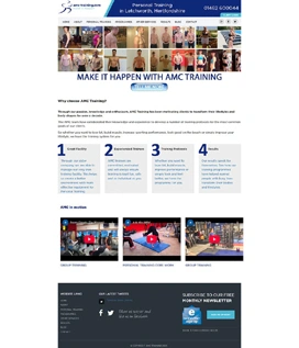
Project interface
- Client
- AMC Training
- Project Type
- Service website
- Industry
- Professional Learning
- Platform
- Responsive web
- Engagement
- Service-page planning, design and responsive delivery
- Status
- Delivered
Business Context
A training provider whose offers need to be compared, not just read.
AMC Training provides professional learning to prospective learners and to the buyers who commission training on their behalf. Both audiences arrive with a question: which offer fits, and what happens next. A website that mixes every service into one flow makes that question harder to answer.
The brief was a service website with clear separation between offer areas, less clutter and content blocks that support an enquiry. It also had to be simple to extend as new service pages are added.
The Challenge
Explain training offers with less clutter, separate service areas more clearly and improve the enquiry path for prospective learners or buyers.
01
Separation between offer areas
Each training offer needed its own clear space so that visitors could compare options without confusion.
02
Reusable section components
New service pages had to be built from existing blocks rather than designed from scratch each time.
03
Scanability for service content
Service descriptions had to be readable at a glance, with the essentials visible before the detail.
04
Conversion-friendly calls to action
Calls to action needed to appear where a learner or buyer is ready to enquire, not only at the foot of the page.
KAPAT Approach
How KAPAT approached the work.
01
Discover
Reviewed the training offers, the two audiences and where the existing presentation created clutter.
02
Structure
Planned the service pages and the content architecture that separates offer areas.
03
Design
Designed reusable content blocks and a corporate visual language suited to service comparison.
04
Build
Delivered the responsive interface with the blocks implemented as components for future pages.
05
Refine
Checked layout consistency across devices and adjusted CTA placement along the page flow.
What Was Delivered
What was delivered.
01
Service-page planning
A page structure that segments training offers for easier comparison and clearer browsing.
02
Responsive interface design
A corporate interface that presents service content consistently across desktop and mobile.
03
Lead-supporting content blocks
Reusable blocks that explain an offer and lead towards an enquiry, ready for new service pages.
04
Cross-device layout consistency
Layout behaviour verified so that the service journey reads the same way on every device.
Interface
Selected interface views.
Verified screenshots only. Frames marked in preparation are replaced as screenshots are approved for publication.
Project Interface Preview
Content In Preparation
Project Interface Preview
Content In Preparation
What KAPAT Handled
KAPAT's contribution.
Outcome
The website now supports a clearer browsing journey, with better separation between services and stronger enquiry intent across the page flow.
Related solutions and services
Related Solutions
- Solution PageCustomer & Vendor PortalsView solution
- Solution PageBusiness Operations & Workflow SystemsView solution
- Solution PageAI-assisted Business SystemsView solution
- Solution PageHealthcare & Clinical PlatformsView solution
Related Services
Work
Need a system built with this level of care?
Start with the business problem. KAPAT will define the architecture, the scope and the engineering approach with you.
A direct conversation with the engineers who would build the system — no sales layer in between.
View Services