Aaryom
A brand website that feels trustworthy at first sight and tells the story clearly to first-time visitors.
Aaryom needed a premium-looking brand site with a calmer visual rhythm, clearer storytelling and a more deliberate conversion path. KAPAT focused on a polished brand presentation: stronger first impressions, sharper page hierarchy and an interface that feels credible on both mobile and desktop.
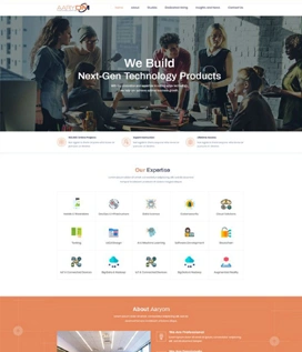
Project interface
- Client
- Aaryom
- Project Type
- Brand website
- Industry
- Lifestyle & Consumer
- Platform
- Responsive web
- Engagement
- Brand-led design and responsive front-end delivery
- Status
- Delivered
Business Context
A consumer brand whose first impression has to carry the sale.
Aaryom operates in the lifestyle and consumer space, where most visitors arrive without prior knowledge of the brand. The website therefore has to do two jobs at once: establish a premium, credible tone immediately, and then explain the offer in a way that holds attention through content-heavy sections.
The brief was a brand presentation rather than a catalogue. Visual restraint mattered as much as polish, page hierarchy had to stay clear on a phone, and the section system needed room to grow as the brand adds content.
The Challenge
Create a premium digital brand presentation that feels trustworthy immediately and supports clearer storytelling for first-time visitors.
01
Premium tone, restrained styling
The site had to feel premium through spacing, typography and pacing rather than through decoration or added complexity.
02
Flexible sections for growth
Page sections needed to be modular so that new brand content could be added without redesigning the page.
03
Readable content rhythm
Content-heavy sections had to keep a steady reading rhythm across mobile and desktop viewports.
04
Clear service and value communication
The brand story and its value had to come through without the visitor having to work for it.
KAPAT Approach
How KAPAT approached the work.
01
Discover
Reviewed the brand positioning, the audience arriving for the first time and the content the site had to carry.
02
Structure
Planned a modular section system and the conversion path from first impression to enquiry.
03
Design
Designed a calmer visual rhythm and sharper hierarchy with restrained corporate styling.
04
Build
Delivered the responsive user interface with the section system implemented as reusable blocks.
05
Refine
Reviewed hierarchy and reading rhythm on mobile and desktop and adjusted pacing where sections ran long.
What Was Delivered
What was delivered.
01
Brand-led page design
Pages designed around the brand story, with a premium tone carried by layout and typography.
02
Visual hierarchy refinement
Sharper hierarchy across content-heavy sections so the most important message reads first.
03
Responsive user interface
An interface that holds its hierarchy and credibility on both mobile and desktop.
04
Content-led conversion design
A deliberate path from storytelling to action for visitors who are new to the brand.
Interface
Selected interface views.
Verified screenshots only. Frames marked in preparation are replaced as screenshots are approved for publication.
Project Interface Preview
Content In Preparation
Project Interface Preview
Content In Preparation
What KAPAT Handled
KAPAT's contribution.
Outcome
The published experience reads as calmer, more premium and more deliberate, with better hierarchy across content-heavy sections.
Related solutions and services
Related Solutions
Work
Need a system built with this level of care?
Start with the business problem. KAPAT will define the architecture, the scope and the engineering approach with you.
A direct conversation with the engineers who would build the system — no sales layer in between.
View Services